Separate moving from zooming
From the same camera position, changing focal length changes how much of the scene you include. It does not by itself create a new viewpoint. Moving closer changes the relative sizes of near and far elements. This distinction matters when a doorway looks too dominant or a distant tower seems too small. Zooming may crop the problem without changing the underlying relationship.
Try a simple comparison beside a building corner. Make a close view with a wide setting, then step farther away along a safe route and use a narrower angle of view to keep a similar amount of the building in the frame. Compare the near corner with the far edge. What is often called compression is associated with the more distant viewpoint, not a mysterious property that rearranges space inside the lens.
Choose what the verticals should do
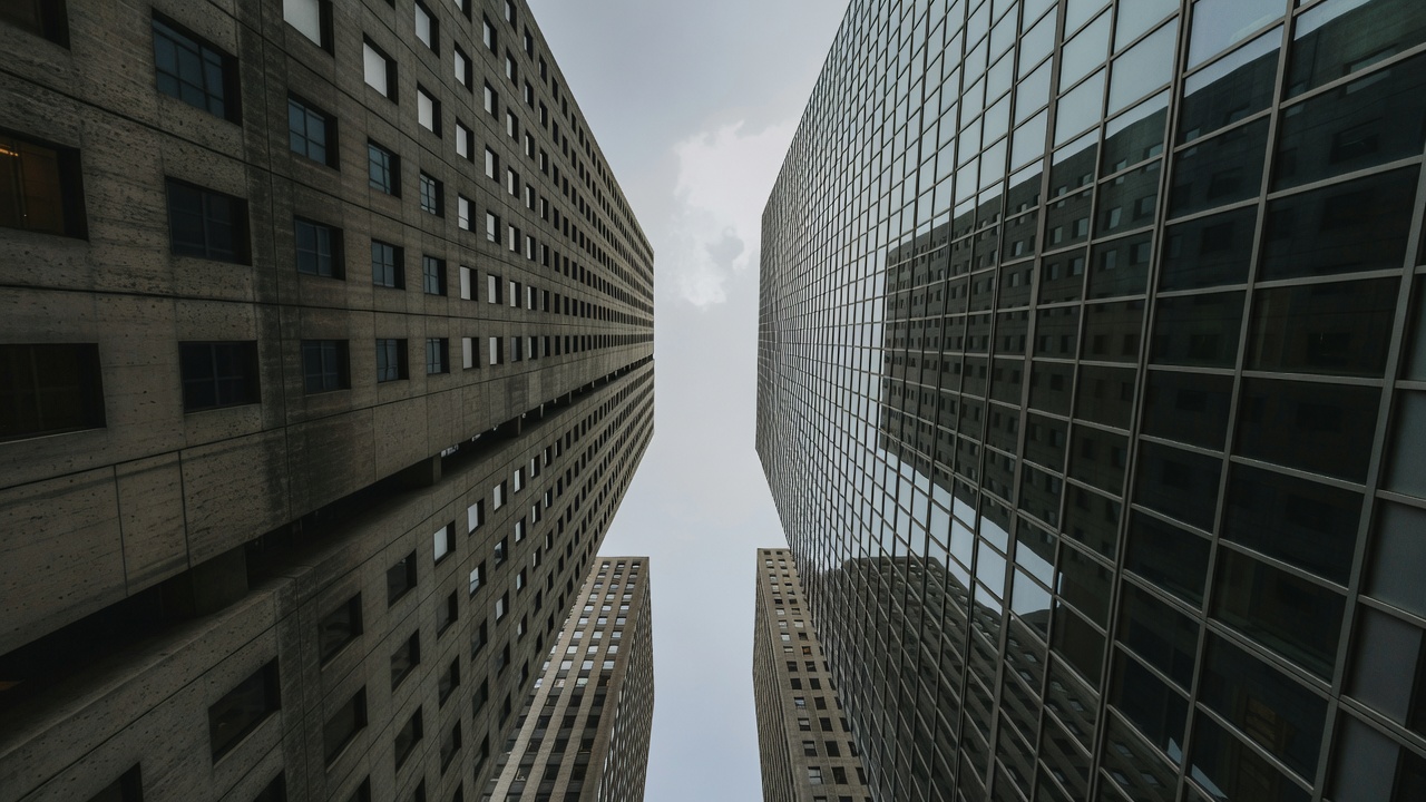
When you tilt upward, vertical edges tend to converge toward a point above the frame. This can communicate the experience of standing beneath a tall structure. It can also make a quiet facade study feel unstable. Neither result is universally correct. Decide whether the photograph is about the building's proportions or the sensation of looking up at it.
For a more elevation-like view, keep the camera level and include additional foreground if necessary. Crop later if resolution allows. A shift lens can change framing while maintaining the camera's orientation, but it is specialist equipment rather than a starting requirement. Software correction is another option, with the cost of cropping and possible stretching. Leave space around important edges if correction is part of your plan.
Change height without inventing access
A lower camera may emphasise a plinth, entrance steps or projecting canopy. A higher public viewpoint may reveal roof relationships that disappear at street level. Start with legal, ordinary options: a public terrace, a permitted museum balcony or a gently sloping pavement. Check the site's current rules and do not assume that a publicly visible roof is publicly accessible.
The Centre Pompidou in Paris, designed by Renzo Piano and Richard Rogers, is a useful reference for thinking about circulation as visible architecture. At London's Barbican, raised pedestrian routes offer another way to understand how buildings connect. Access and operational conditions can change at either place. The lesson is to investigate legitimate routes, not to seek a dramatic position at any cost.
Give the foreground a job
A foreground element should help explain the subject. A passage can frame an entrance; a column can introduce a sequence; a tree can show the distance between the street and the building. If an object only blocks part of the facade, try moving until it either becomes a deliberate shape or leaves the frame. Half-decisions are often more distracting than obvious obstructions.
The courtyard and pyramid at the Louvre in Paris demonstrate how older facades and a newer geometric object can share a frame. You can make a picture about contrast, alignment or movement through the courtyard. Those are different subjects. On your own route, an ordinary bus shelter against an older wall can offer a similarly useful comparison of scale and material.
Keep human scale without staging a crowd
A person near a doorway gives the eye a familiar reference, but people are not interchangeable measuring devices. Avoid intrusive close views or isolating someone in a potentially sensitive situation. Consider whether an entrance, handrail, bicycle or bench can communicate scale just as clearly. Rules about photography and publication vary by location and use, so check what applies to your circumstances.
If you wait for a pedestrian to cross a composition, stay clear of the route and do not pressure anyone to move. Think about where their silhouette falls: a person against a busy window grid may be unreadable, while the same figure against a quiet wall can clarify the whole scene. The aim is to describe how the building meets daily life, not to erase the people who use it.
Make three positions earn their place
Choose one building and make a frontal frame, an oblique frame and a detail. Give each a different purpose. The frontal view might explain rhythm, the oblique view might separate volumes, and the detail might reveal a joint or threshold. If all three say the same thing, change one position rather than simply trying a different crop.
Review the sequence as a small story. Can someone unfamiliar with the place understand its overall form and one distinctive relationship? You do not need to describe every elevation. A coherent set of modest observations can reveal more than one spectacular angle that hides the building's organisation.